October 5, 2017
Optimizing Onboarding for Benchmarcs
Through Metto , I helped design and build a web application called Benchmarcs that allows funeral homes to monitor trends in business for both their own individual homes and their competitors.
Traditionally, funeral homes tracked “calls,” or deaths, by skimming through obituaries in local newspapers and obituary websites. Because the calls listed in these sources also indicated which funeral home would be performing the funeral, each home could track how much business each competitor was receiving.
With Benchmarcs, we helped automate this process by using web spiders to crawl online data and assess when and where calls happen. This helps homes save time and money and provides a central hub of important competitive data.
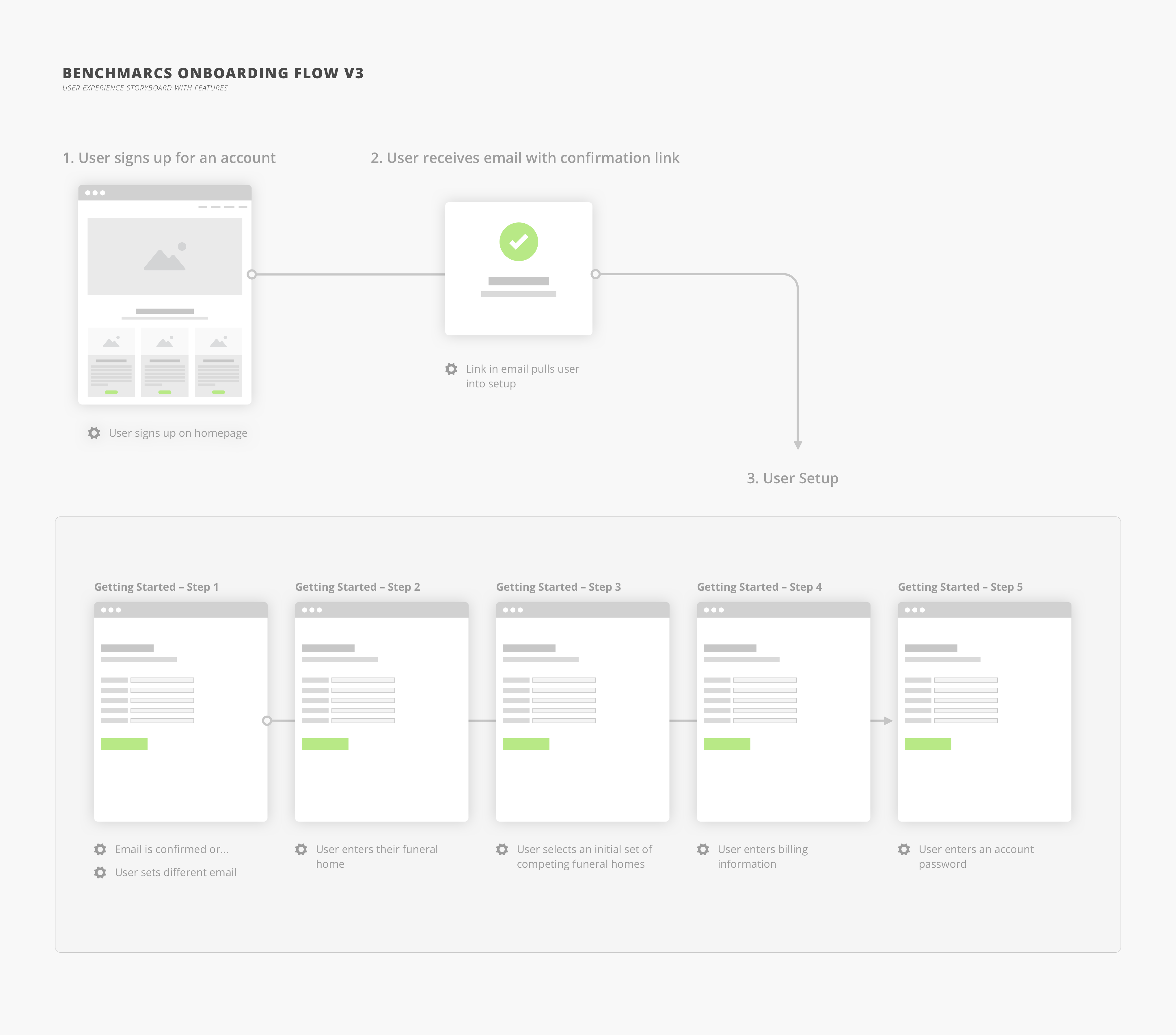
Setting Up New Users with Actionable Content
One of the biggest advantages in moving toward an automated system like Benchmarcs is that it gives funeral homes the ability to track their competition.
Adding competitors allows users to see how many calls a competing home received over the last week, month, year, etc and also see trends in calls over that period of time.
In order to educate new users about the ability to track competitors and to help populate their accounts with competitor data, we decided to integrate the ability to add competitors into the onboarding process.
Evaluating Funeral Home Needs
Conversations with our product owners and several potential users led us to focus on the addition of competitors on a local, rather than regional or national level. We learned that even when a competitor has multiple locations across a state or region, funeral homes tend to focus on the competing branch closest to them.
To allow users to add competing funeral homes, we started by approximating the user’s location to show a suggested set of homes in their area. The page displayed the user’s closest zip code and provided a radius selector to filter results.
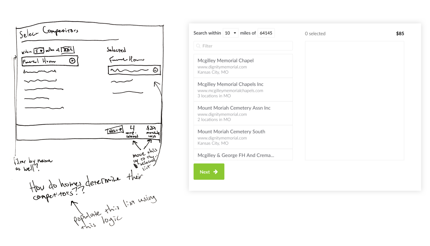
Improving the Initial Design
While some aspects of the initial functionality fit the bill, the nuances of the design did not. New users would choose several homes from the pre-populated list before becoming frustrated when they couldn’t find the home they were looking for.
It was unclear to users that the list of homes was a smaller list of suggestions rather than a complete list of all competitors. In the end, this solution made the tool less useful to users and converted them with less competitors than than they really wanted.
After several of usability sessions, our team decided to improve the design of this feature.
Iterating to Improve Usability
To improve usability, we made a couple of changes to both the visual design and functionality:
- We did away with ZIP and radius – user testing had shown that these fields were not being used and that users instead focused on the search input
- We made the search bar more prominent in order to guide the user to take action
- We added the title “Suggested Competitors” to the preloaded competitors list to communicate to users that this initial list wasn’t exhausted
- We added functionality to deliver more and more relevant results on each selection. Now, each time the user picks a competitor, we hit the Benchmarcs API, search for homes near the selected competitor and add them to the list of suggestions. Then, we re-sort the list based on how many times a competitor is suggested in relation to the competitors selected by the user.
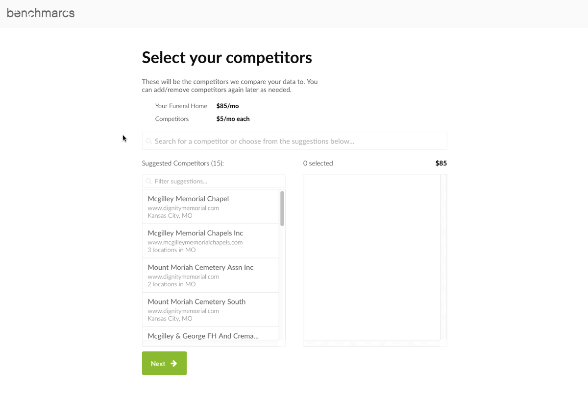
While seemingly small, the updated design makes the tool more useful to user and has increased the number of homes a new user would add during setup.
Not only could users find the homes they were looking for, but the updated functionality helped give them better suggestions.
Takeaways
- When it comes to the design of a feature, the smallest details can create a big impact. Even if it’s simply modifying a label or moving an input, a change in design can drastically affect the end user’s experience with your product.
- User test throughout the design and development process in order to uncover areas for improvement.
- Always be iterating. It’s easy to become complacent, but the best solutions come through thoughtful refinements.