Product Design, UX/UI
Service Year
Connecting young Americans with non-profits and other organizations, Service Year is the nation's online platform for national service opportunities.
Project Overview
The Service Year Alliance teamed up with ISL to design and develop a digital platform for young Americans to connect and serve with the nation’s best nonprofits. Service Year aims to make a year of service a common expectation and opportunity for every young American.
An ongoing and ever-evolving project, the site brings the nation’s best service opportunities into one place, allowing both organizations and service corps members to more easily connect with one another.
My Role
I served as a lead visual and user experience designer on Service Year. While working with a team of designers, developers, and project managers within ISL, we also worked closely with our client, the Service Year Alliance to bring their vision to life.
Over the course of the project, I worked on anything from initial user research to the creation of user flows, wireframes, and interactive prototypes to the final visual and interaction design of both the marketing site and web application.
Creating the Service Year Ecosystem
While Service Year is built on the idea of connecting organizations with American youth, we needed to create a platform that catered to a variety of users and content types.
Whether you’re the administrator that manages your organization’s profile and prescense on Service Year, someone recruiting service members for an organization, or an individual looking for a service opportunity, Service Year needs to connect you to where you want to be.
Information Architecture
Beginning in the kickoff meeting with our client, we began to assess everything that would make up the Service Year Exchange platform.
Initial sitemaps helped our team lay out initial screens for everything from the marketing pages to the various interactions users would take when listing and discovering service opportunities.
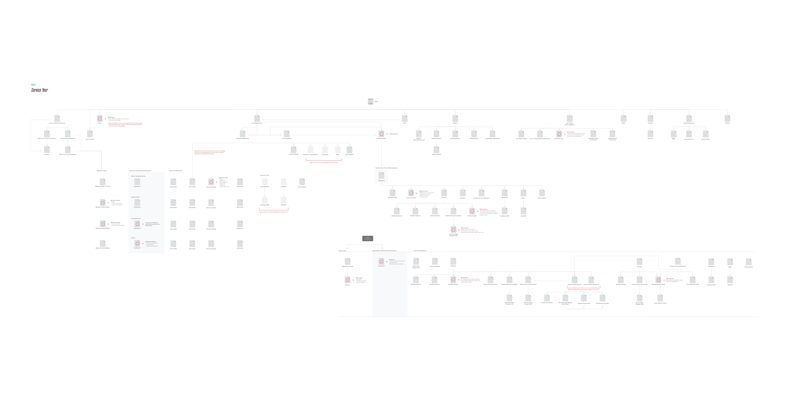 Initial sitemaps can give an idea of the number of screens/interactions needed for a project of this scale.
User Flows
We then began creating user flows for the paths each user type would take when being brought onto the system, browsing opportunities, or recruiting corps members.
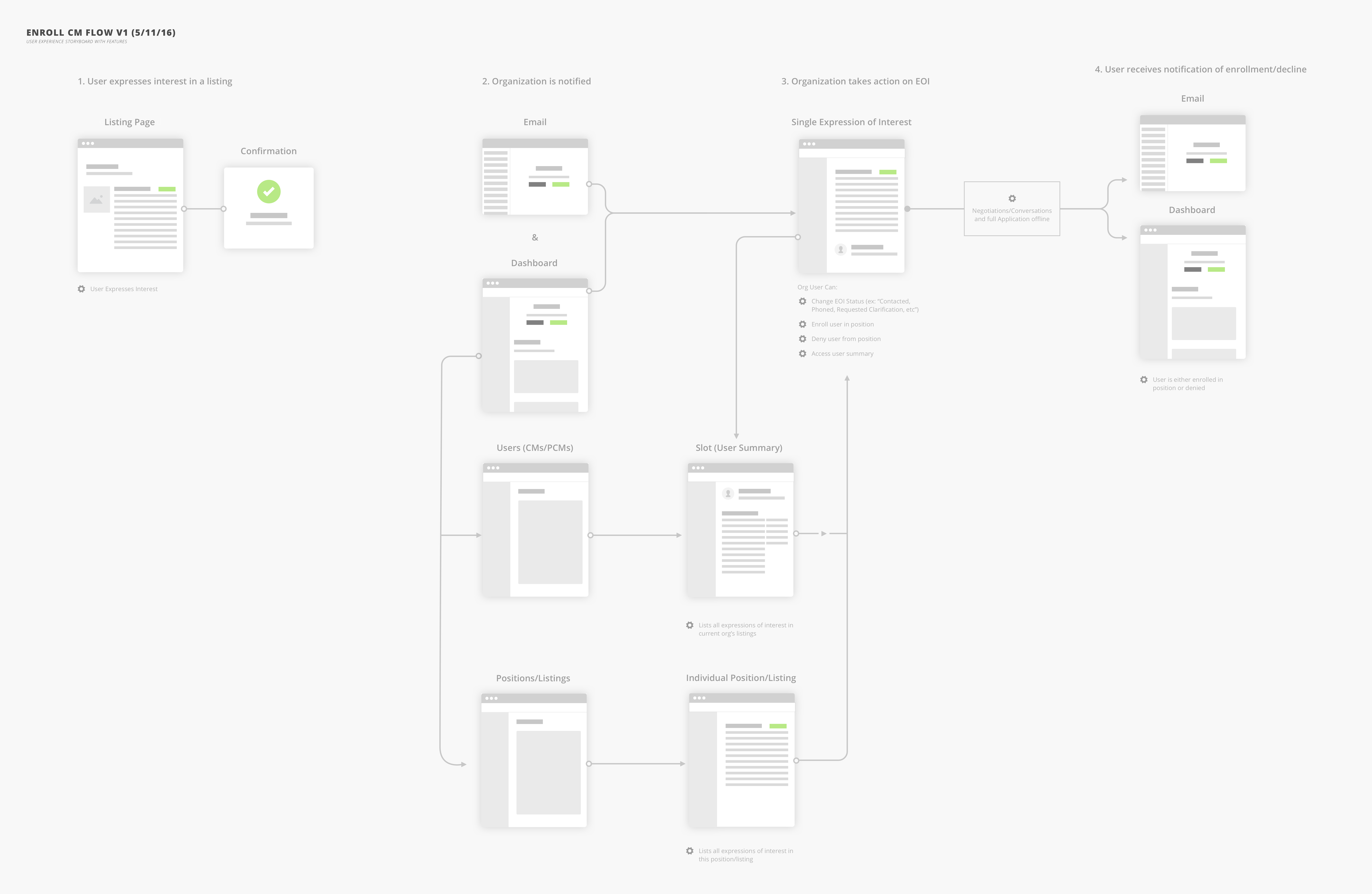 User flows allowed our team to define the paths users would take to accomplish tasks.
This user flow shows a corps member expressing interest in a position and an organization's path to taking action on that interest.
While user flows were an essential part to getting the project started, it wasn’t always such a linear process. Our team worked within an agile process, using two-week sprints to accomplish tasks on a story-by-story basis. We iterated on different parts of the UX and design process depending on the task at hand.
Wireframes & Prototypes
With each new page or interaction being added to the system, our team would create sets of wireframes in Sketch, Balsamiq, Omnigraffle, or even just pen-and-paper sketchs. Often, we linked these wireframes together in Invision in order to get a sense of how the screens would connect.
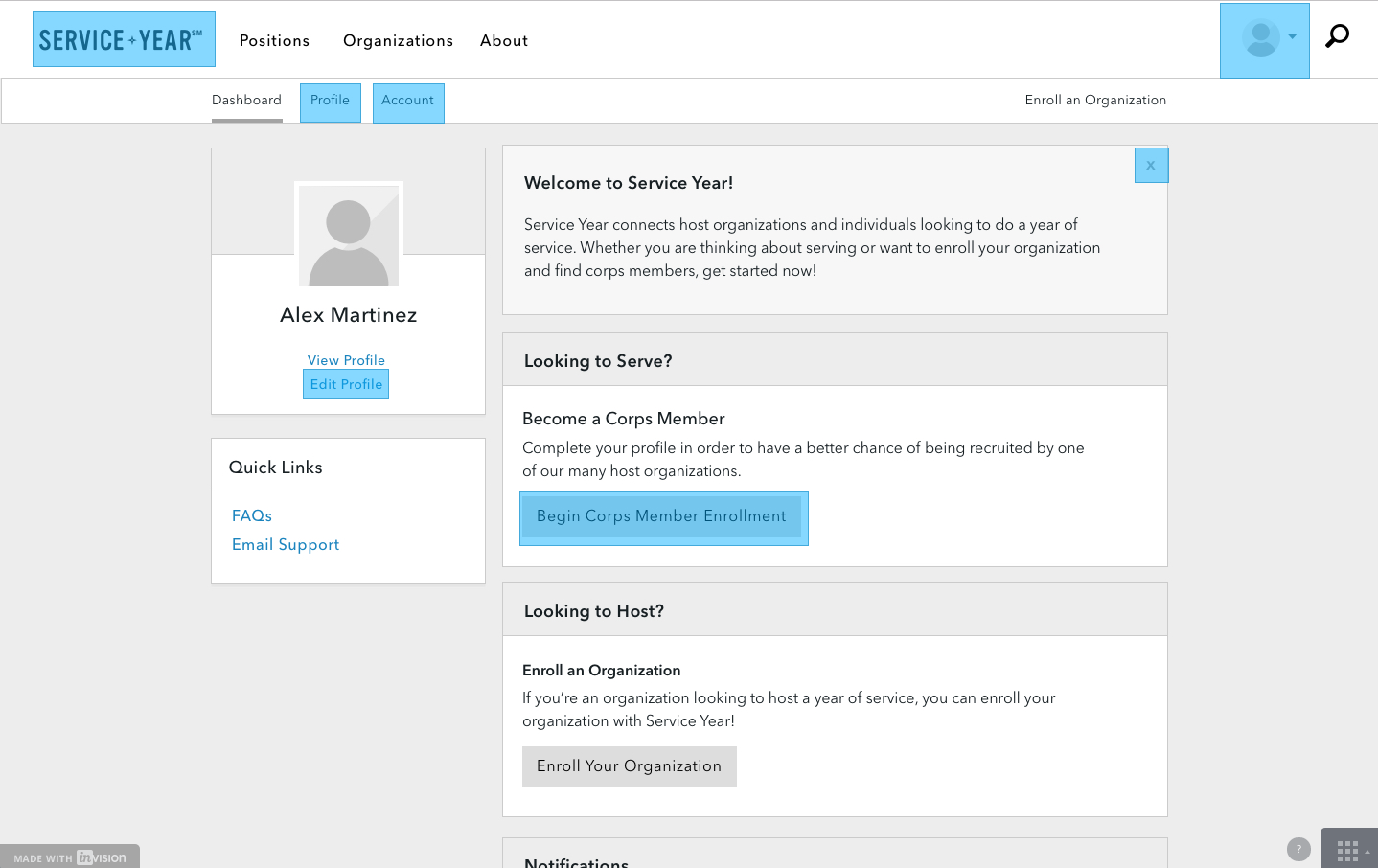 Prototypes allowed us to think through flows for different user interactions. Here is an early prototype of onboarding new corps members to Service Year.
(View Prototype in New Window)
Prototyping allowed us to see when certain interactions felt great (or just awkward). Not only that, but it also allowed us to share in-progress work with our client and receive quick feedback.
Visual Design
Due to the scale of Service Year, our team worked around the idea of component-based design. Each part of a page not only needed consideration in terms of responsive design, but also necessitated the creation of assets for multiple states. Each component then had to work alongside other components in the page.
The use of component-based design helped us to define atoms and molecules that could then be used to build organisms, templates, and finally, pages (See Brad Frost’s Atomic Design).
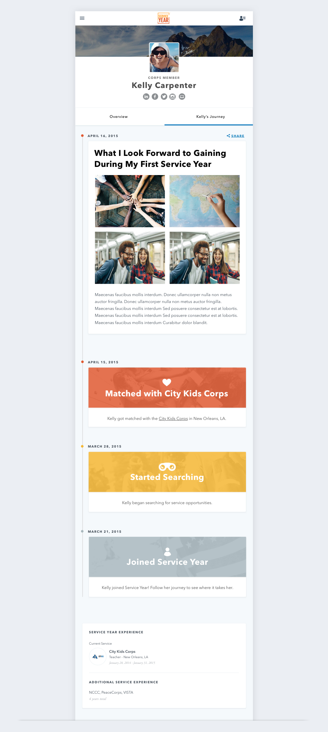
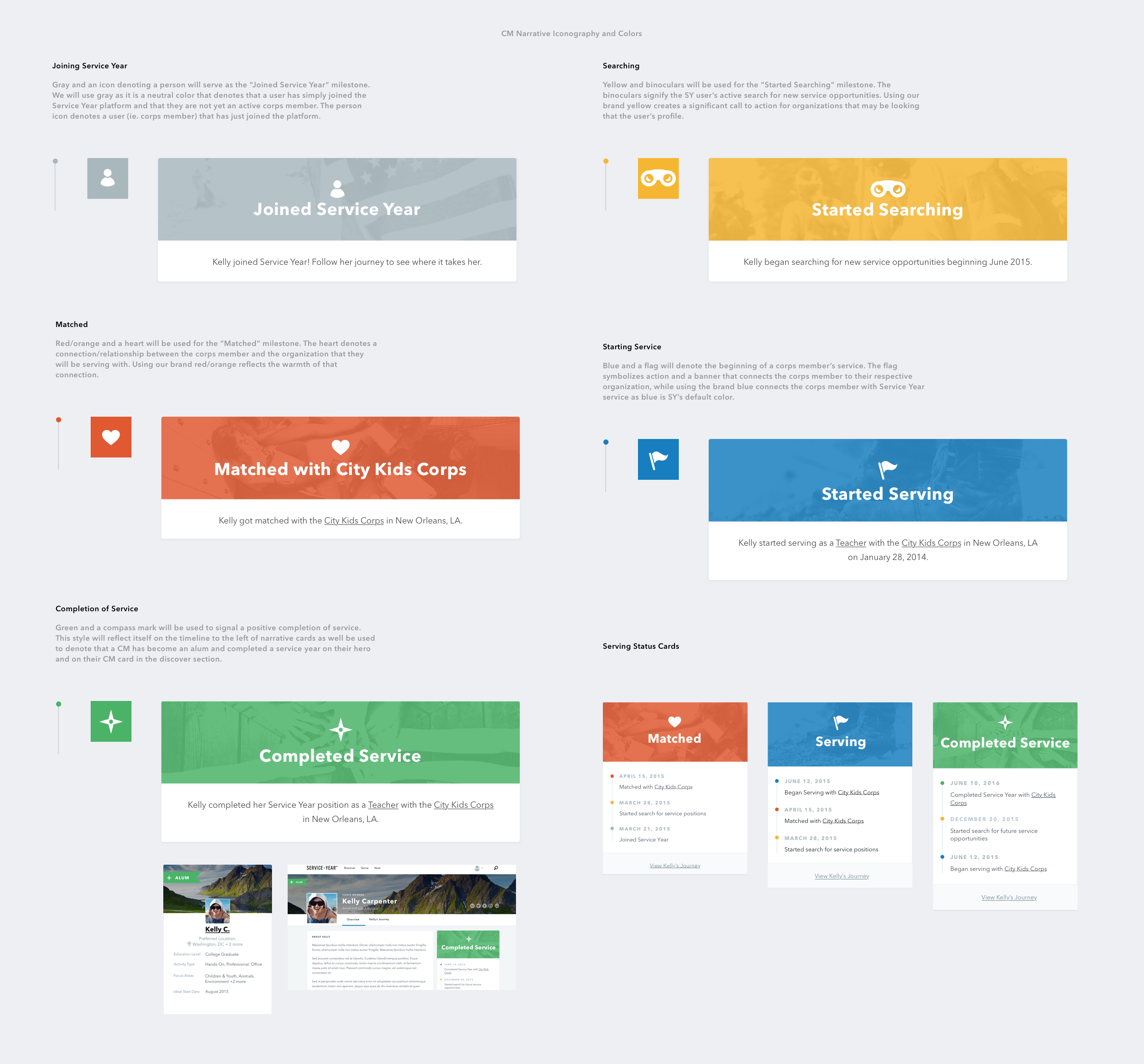 A look at the different states for the serving status block within a Corps Member's public profile.
A Living Design System
While web style guides and frameworks have been around for several years, the explosion of large-scale web applications brings an extra focus on creating design systems. Style guides like Salesforce’s Lightning Design System or Dropbox’s Scooter have set a standard for the design community.
Our design and development teams collaborated to create our own living style guide for the Service Year platform. The style guide is ever-evolving and allows for better design/dev collaboration.
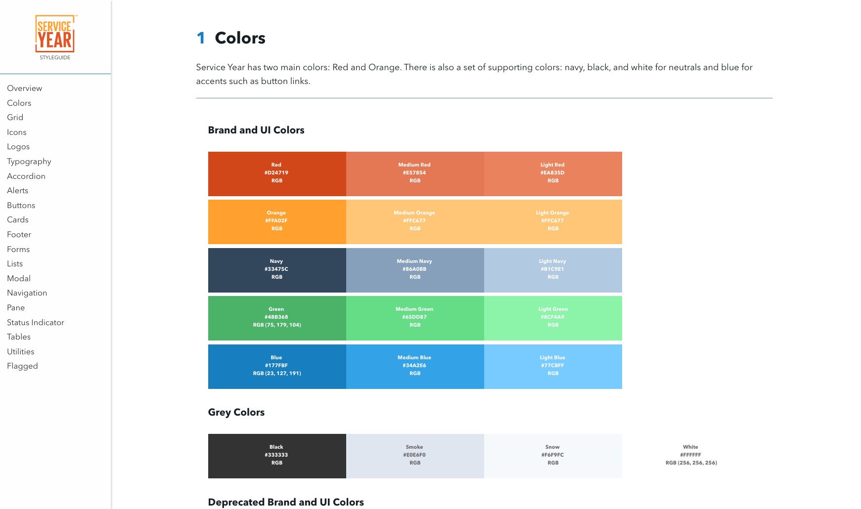 The Service Year Style Guide helps designers and developers to collaborate when designing, building, and iterating on components. (View Style Guide)
Working in Agile
Service Year is the largest web application that has ever come through ISL. With such new territory came the need to figure out new and effective processes for managing, designing, and developing.
From the onset, our team implemented an agile workflow in order to quickly design, build, and ship iterations of the Service Year platform.
Collaborating with the client, our workflow began with the creation of user stories that defined functionality for the platform. Both the design and development teams would take these user stories from a Google Spreadseet backlog and work on them in 2 to 3 week sprint cycles.
Not only were we iterating on Service Year as a platform, but we were constantly learning what worked best within our own workflow and modifying our processes accordingly.
Conclusion & Lessons Learned
Working on a product that makes such a positive impact is a very rewarding experience. Service Year is an ever-evolving platform and the largest web application that I’ve been involved in.
A couple of things stuck out to me during my work on Service Year:
Building Large Scale Applications
Design systems for large scale applications take a lot more work than you may think. I learned through Service Year how important collaboration between design, development, and project managers is key to a successful project.
Learning to Fail and Improve
You’re never going to get a design 100% right the first time and that’s ok. The iterative process of short design and development sprints allow room for testing new ideas, learning their shortcomings through user-testing, and then improving on the next go-round.
New Design Processes
Service Year helped me learn how to work within a new type of workflow. Before this project, I had most often been involved in more traditional waterfall workflows. With Service Year, I learned more about the cyclical and collaborative nature of an agile sprint process.

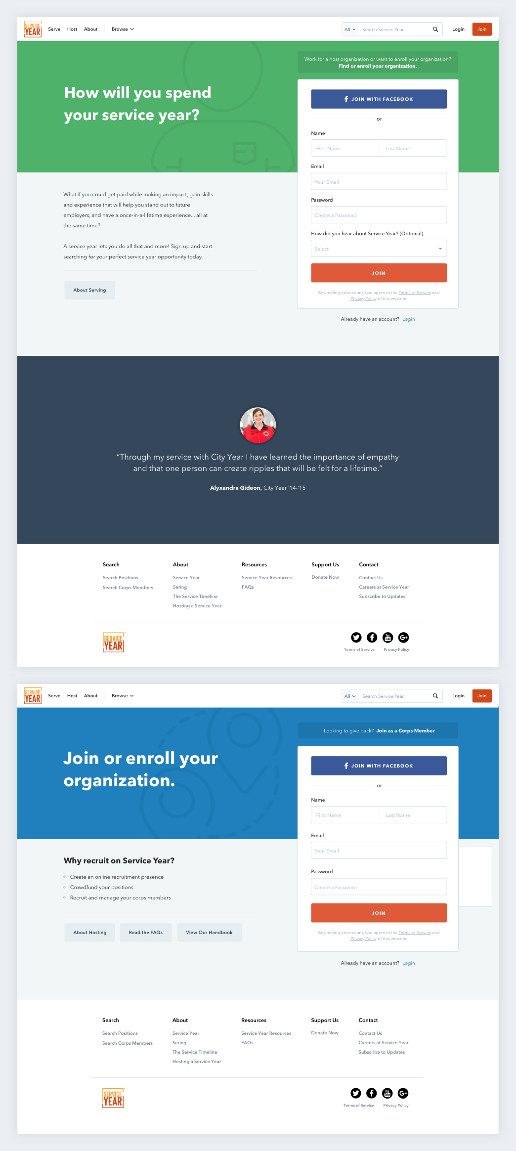
Visit ServiceYear.org