React/React Native, Visual Design
Tap In Guide
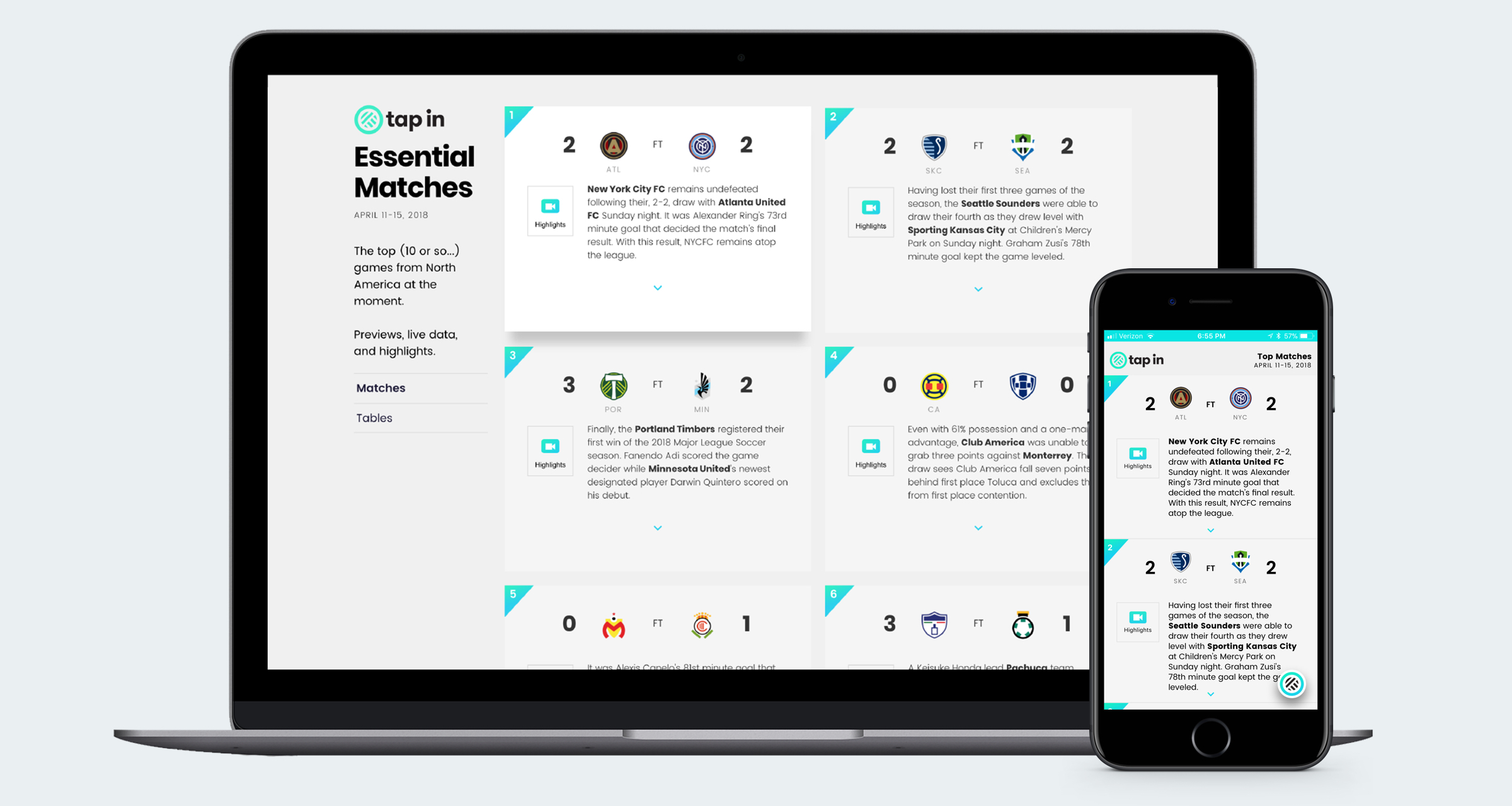
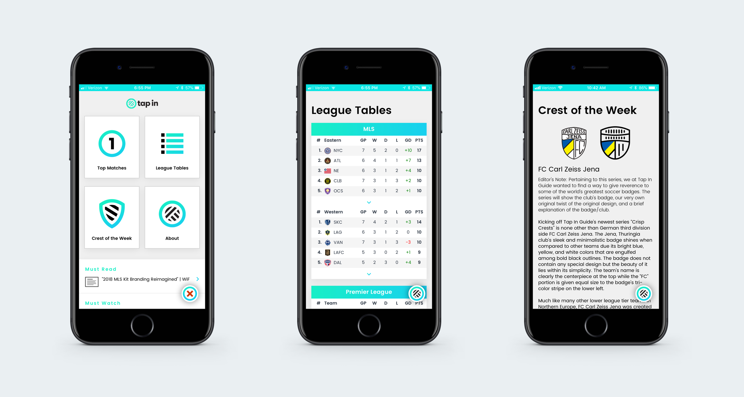
A responsive website & mobile soccer calendar application with context. Everything soccer fans need to know about the matches of the moment.

A Guide to World Football’s Essential Matches
Tap In was a simple dashboard guide to world football’s most essential matches. The application is designed to deliver all the daily information soccer fans need to know to stay on top of the beautiful game in real-time.
My Role
It was the 2014 World Cup in Brazil that kicked off my obsession with the beautiful game. I grew up following American sports, but never had really paid any attention to the world’s sport: (the real) football.
I initially stumbled across a version of Tap In during the summer of 2014 produced specifically for that year’s World Cup, but didn’t pay it much attention after Germany were crowned champions that summer.
Fast forward to 2017 and I happened upon the site again, but this time it displayed a scoreboard of “essential” soccer matches of the moment. Three years into my new soccer obsession, I reached out to the small Minneapolis-based team via Twitter to see if they could use some help.
As it turned out, they were glad to have me on board and I came on as a front-end developer focusing on the React web app and React Native mobile app.

Technologies
Tap In was built using React, React Native, JavaScript, Python, and Django. While I mainly contribute to the React web app, I also helped launch the initial React Native app and now maintain it along with developer David Pett.
The Tap In API, built by Clint McMahon, supplies data via Football API in order to provide users with live match events such as goals, yellow/red cards, and substitutions.
React proved to be a very useful library for building and managing components. Not only that, but by building our app in React Native, much of the front-end structure translates between the two environments, allowing us to quickly ship new features.
Design
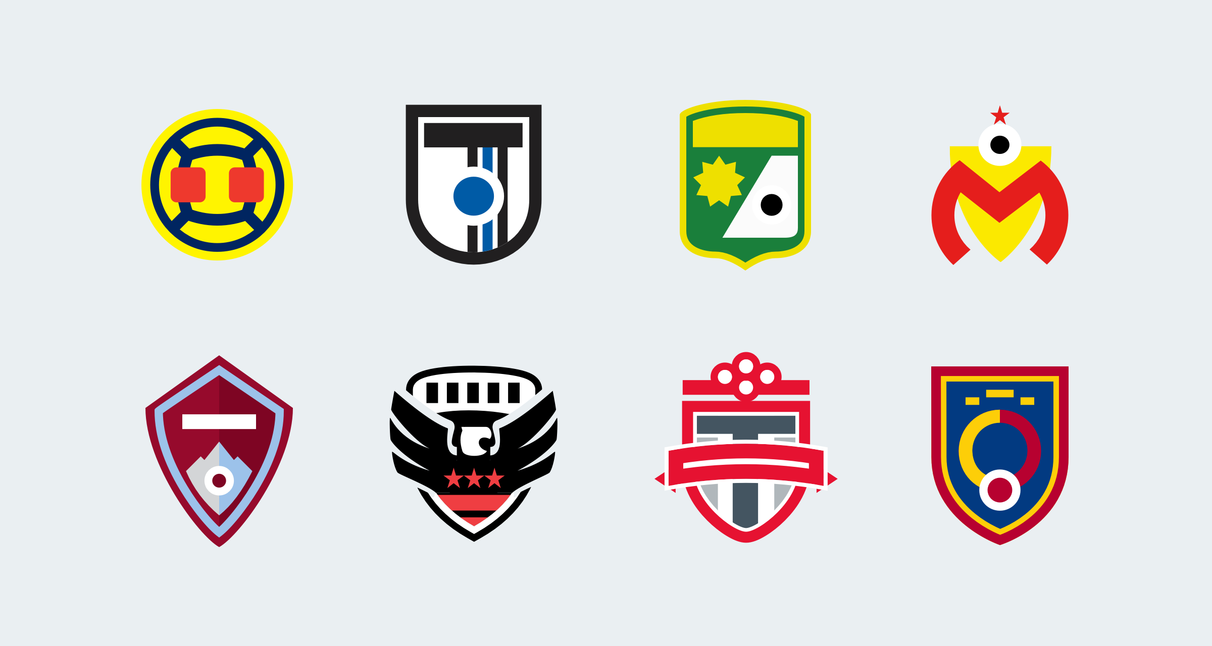
Tap In’s visual style set it apart from other sports websites and apps. Its simple aesthetic was actually one of the things that initially drew me in. Designer Mike Arney developed the core style, taking teams’ crests and reducing them to minimal and geometric icons.
As Tap In added coverage for more leagues (such as MLS in the U.S. and Liga MX in Mexico), we needed to add more teams’ crests. I worked with Mike to develop about two dozen of the crests used in the app today.

Final Thoughts
At Tap In, we were a distributed team with members living in Minnesota, Texas, Ohio, and even Norway. Thanks to platforms like Slack and Trello, we were able to keep in touch, even when many of us had never even met in person.
It was a blast building a project like this. Every team member contributed due to their passion for soccer and even if we hadn’t met on the playing field, we built a sense of camaraderie that transcends sport and technology.
While we closed down the project in late 2018, you can still check out Tap In on Twitter to explore some legacy content.